In today’s chaotic world of marketing, staying relevant is a perpetual challenge. Businesses often grapple with the decision to rebrand or refresh their image to maintain consumer interest. While rebranding can be a powerful tool when executed correctly, a less drastic approach – refreshing the brand – can often yield impressive results.
The Distinction Between Refreshing and Rebranding
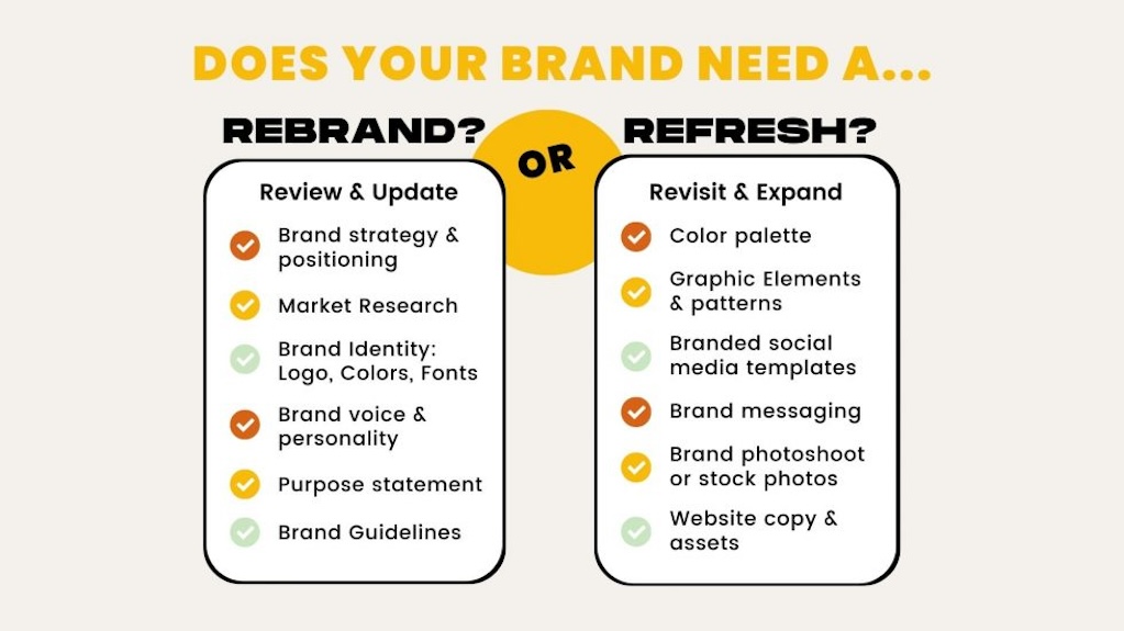
Before looking into case studies, it’s essential to clarify the distinction between refreshing a brand and undergoing a complete rebranding process. Refreshing typically involves making subtle changes to certain brand elements, such as updating the logo, refining the colour palette, or adjusting the messaging.
On the other hand, rebranding involves a more comprehensive overhaul, often including a new name, logo, and a fundamental shift in brand identity.
Benefits of Refreshing a Brand
Cost-Effectiveness:Refreshing a brand is often more cost-effective than a complete rebranding. It allows businesses to maintain brand equity while adapting to evolving market trends.
Maintaining Brand Recognition:A refresh enables a brand to stay recognisable to its existing customer base, preventing confusion and potential loss of loyalty that might accompany a drastic rebranding.
Agile Adaptation:In a rapidly changing market, a brand that can adapt quickly stands a better chance of staying relevant. A refresh allows for agility without sacrificing the brand’s core identity.
Global Case Studies
Starbucks:A global coffee giant, decided to refresh its logo in 2011. The iconic mermaid remained, but the design underwent a simplification, removing the company name and the outer circle.
Results:The refresh allowed Starbucks to maintain its strong brand recognition while presenting a more modern and streamlined image. It signaled to consumers that Starbucks was evolving without undergoing a radical transformation.
Pepsi:In 2008, PepsiCo launched a significant rebranding campaign, introducing a new logo and packaging design for its flagship Pepsi brand.
Results:While the rebrand garnered attention, it also faced mixed reviews. In contrast, Coca-Cola, Pepsi’s main competitor, took a more gradual approach by periodically refreshing its branding elements. This strategic difference highlighted the effectiveness of a refresh in maintaining consumer loyalty.
Google:The technology giant underwent a subtle logo update in 2015. The changes included refining the letter shapes and introducing a brighter colour palette.
Results:The refresh was well-received, and Google maintained its strong brand identity. It demonstrated that even tech giants understand the value of periodic brand refreshing to stay current and appeal to their user base.
Navigating Brand Evolution in a Diverse Malaysian Market
Malaysian brands face the challenge of catering to a population with diverse cultural backgrounds, preferences, and rapidly evolving market trends. Let’s explore how this approach has played out for some prominent Malaysian brands.
AirAsia:In 2016, AirAsia, the region’s leading low-cost airline, underwent a brand refresh. The airline updated its logo, incorporating a sleeker font and a vibrant red color to maintain its energetic and dynamic image.
Results:The refresh allowed AirAsia to stay true to its brand identity while signalling a commitment to innovation and modernity.
In a competitive market, the airline successfully communicated its dedication to providing a contemporary and efficient travel experience without undergoing a complete rebranding.
Petronas:The national oil and gas company, embarked on a brand refresh in 2017. The changes included a more modern logo design, featuring a refreshed colour palette and subtle modifications to the iconic Petronas towers.
Results:The refresh reinforced Petronas’ position as a forward-thinking and globally competitive brand. By maintaining continuity with its existing visual elements, Petronas struck a balance between modernization and preserving the familiarity that Malaysians associate with the brand.
Maybank:In 2020, Maybank, one of Malaysia’s largest banks, unveiled a refreshed logo and brand identity. The changes were subtle, with a focus on a more contemporary design and an updated colour scheme.
Results:Maybank’s strategic refresh allowed the bank to align its visual identity with the evolving expectations of its diverse customer base. The bank successfully communicated a commitment to innovation and customer-centricity without causing confusion or alienating its existing clientele.
The strategy of “Refresh Rather Than Rebrand” becomes even more crucial in Malaysia. Brands need to navigate cultural sensitivities, cater to diverse tastes, and stay agile in a rapidly changing market.
The case studies of AirAsia, Petronas, and Maybankexemplify how a thoughtful approach to brand evolution can ensure continued relevance and resonance with Malaysian consumers.
As businesses continue to evolve, the key lies in striking a balance between staying true to heritage and embracing the dynamics of a multicultural and diverse market.
We use cookies to ensure that we give you the best experience on our website. If you continue to use this site we will assume that you are happy with it.OkNoPrivacy Policy


![HNK MUSIC – 800×435 [FOR PRESS RELEASE]](https://marketingmagazine.com.my/wp-content/uploads/2024/05/HNK-MUSIC-800x435-FOR-PRESS-RELEASE-150x150.jpg "HEINEKEN ‘REFRESH YOUR MUSIC’ UNLEASHES MEANINGFUL EXPERIENCES ENTICING FANS TO EXPLORE AND DISCOVER NEW MUSIC TOGETHER!")
