Posted on by Vishnu Devarajan
Subscribe to our Telegram channel for the latest updates in the marketing and advertising scene
The Pepsi Rebrand and Why Nostalgia Is Important in Marketing
17 May
If you’ve been following the design world lately, you would’ve noticed a seemingly growing trend where many companies have been doing a complete overhaul on their brand identity.
And it’s not only reserved to small startups or local businesses either; big-name brands and corporations have gone in full gear recently in updating their logos and brand identity, while embracing new design trends.
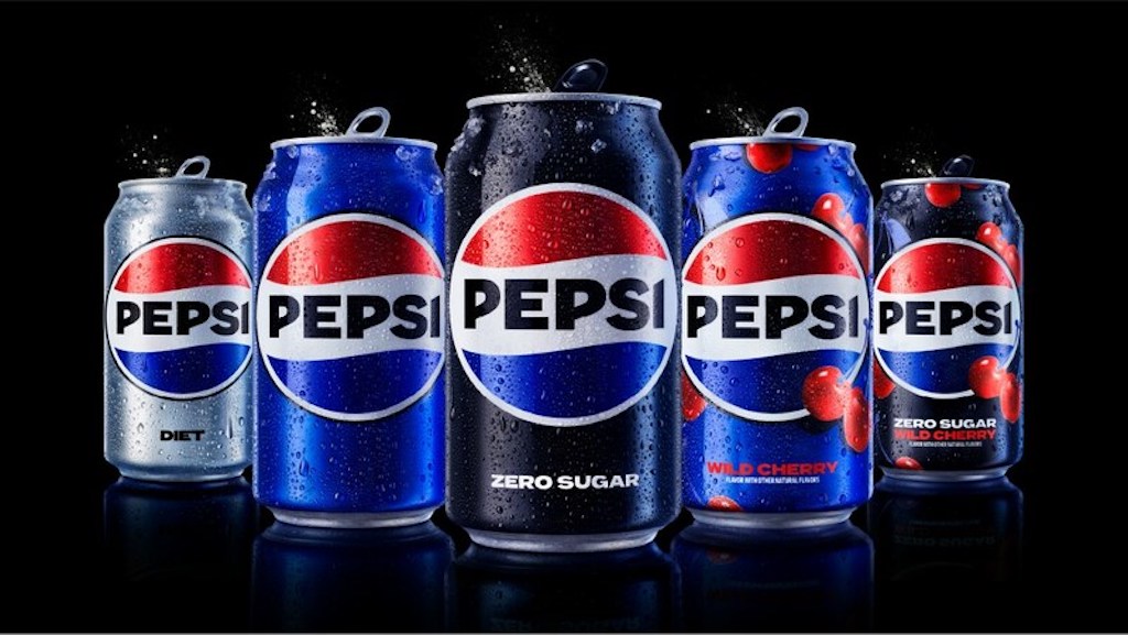
More recently, soft drink conglomerate Pepsi just unveiled a new logo and rebrand that harks back to the golden age of the company. And they aren’t the only ones doing this either.
Many companies are now resorting to going back to design styles from the late ‘90s to the early 2000s.
However, the question is: why? Why are so many companies undergoing such a significant change in their branding? Well, there are several key factors driving this trend, including the need to stay relevant and in the public eye, to stand out in a crowded market, the desire to connect with consumers on a deeper level through nostalgia and pop culture, and the constantly evolving nature of design.
Skeuomorphism and Flat Design
Skeuomorphism and Flat Design are probably 2 of the most widely used terms in the design world in recent years. While the two design styles lie on complete opposite ends of the spectrum, they have dominated the design space for very different reasons.
Skeuomorphism comes from the Greek words, “skéuos,” meaning tool, and “morphḗ,” meaning shape. This design dates as far back as the days of Greek architecture, where marble buildings and structures were created to resemble the older buildings that were made of wood.
In essence, skeuomorphism is about creating familiarity to new objects or elements.
For example, take the early days of the iPhone when it was first introduced to the world. Think about how the people of 2007 would’ve felt when the late Steve Jobs unveiled a completely new never-before-seen product. It was new, unique and almost alien to a lot of people, yet still sold over 1.4 million units that very year.
While skeuomorphism isn’t the only factor that contributed to the hugely successful sales numbers, it did play a very important role.
Take the homescreen of the first iPhone and look at the icons laid out on there. The Phone app uses an icon that resembles an old telephone (that’s almost extinct in today’s world), the Email app uses an envelope, which the app itself doesn’t even use.
Similarly, the clock app uses an old analogue clock icon despite it being completely digital. This is what Skeuomorphism is – creating familiarity with the unfamiliar. Also notice that the icons here have a slight gloss over them, almost resembling an actual physical button.
Fast forward 6 years later since the release of the original iPhone, and you’ll notice a significant shift in design language on the product. At this point, Apple, the very same company that once used Skeuomorphism in their operating system, has shifted into a more modern and rather bold approach in its design language.
In 2013, with the release of their brand new operating system, iOS 7, Apple unveiled a complete overhaul to their once familiar design. While it wasn’t a total change that would alienate its current user base, it was new enough that it felt different. Everything felt “flat,” hence the name, Flat Design.
Flat Design takes design cues from minimalism, opting for a more straightforward approach than overcomplicating things. At this point, the market was already familiar with apps and the world of smartphones. Therefore, it seemed unnecessary for Apple to keep its Skeuomorphic design and get with the times.
Flat Design feels modern and fresh. This was a time when many companies besides Apple were also adopting this newer and trendier design language.
From Windows with the release of their then latest operating system, Windows 8, to ironically, Pepsi, and even companies like Instagram were all rebranding with Flat Design during this time.
Google, however, took this one step further by introducing Material Design, which was a more refined version of Flat Design that some companies quickly adopted as well.
The Resurgence of Nostalgia Marketing
Unfortunately, as time went on, Flat Design became boring and repetitive. Some companies began to feel that the flat and minimalistic design style was limiting and lacked personality. So, it was back to the drawing board once again as brands began their quest in searching for the next best design trend.
Then something happened. We started seeing a shift in pop culture with everything from music to film and TV shows making a conscious effort to bring back the styles of the late ‘90s to the early 2000’s.
TV shows like Netflix’s “Stranger Things” harnessed the power of nostalgia marketing so effectively that it brought a significant increase to the public’s love for the culture of that time.
Now “Stranger Things” wasn’t the sole catalyst for the resurgence of nostalgia marketing, but it certainly helped elevate it. Design styles from the late ’90s to early 2000s, offered a playful and nostalgic alternative to the clean and functional aesthetic of Material Design, which was precisely what many brands and companies were looking for.
See, the design styles from the late ’90s to early 2000s were not only colourful, bold, and playful, but they had the zing that companies desperately needed. It is no secret that the recent pandemic made the world feel sad and filled with dread, and the last thing any brand would want is to be associated with all that misery.
This is why brands needed a rebrand – to shy away from that cold empty feeling and evoke positivity among its consumers. Plus, these design styles also elicit a sense of nostalgia for the early days of the internet (a better and happier time) and the rise of technology, which many consumers associate with innovation and progress.
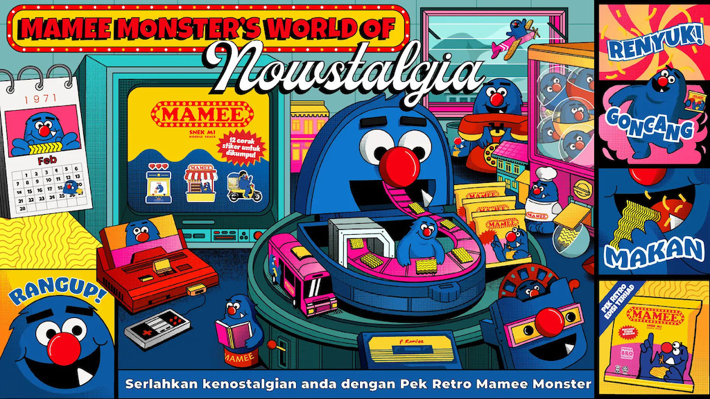
Mamee Monster’s World of Nostalgia
(Source: Mamee)
Companies are tapping into this by reviving design styles from this era to connect with consumers on a deeper level.
Similar to Pepsi, homegrown noodle snack Mamee Monster also brought back their classic bright yellow packaging that featured the iconic blue monster in retro 2D format for a limited time in honour of the company’s later founder and executive chairman, Datuk Pang Chin Hin.
In a campaign titled, “Mamee Monster’s World of Nowstalgia,” the company aims at leveraging the childhood nostalgia and turning it into something modern.
Champion
Hanesbrands Inc. owned sportswear brand, Champion was a staple of the ‘80s and ‘90s with their classic “C” logo prominently featured across all their products. The brand was known amongst basketball fans as they produced the kits for major teams.
However in 2018, the brand made a conscious effort to move into the streetwear market by using nostalgia as a way to draw customers back in. They used vibrant colours from the yesteryears as well as over-sized apparels and this resulted in the brand skyrocketing to a whopping $1.36 billion in revenue that year.
Today, Champion has become another high-street brand that’s featured in some of the top retail chains such as Topshop, Urban Outfitters and ASOS, proving that nostalgia marketing does indeed work.
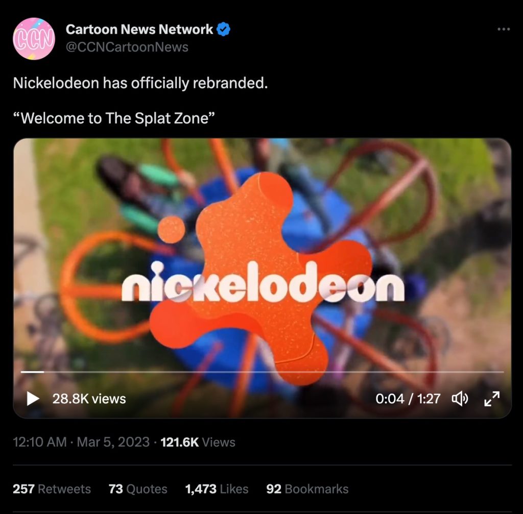
Nickelodeon
(Source: Twitter)
Kids TV channel Nickelodeon also reverted back to their old logo recently, incorporating design elements from the network’s ’90s era with the signature orange splat and the playful typography. This rebrand was well-received by fans who grew up watching shows like “Rugrats” and “Hey Arnold!,” and it helped Nickelodeon stand out among the competition in the crowded children’s TV market.
So what is the takeaway from this? Well, for starters, nostalgia is indeed a powerful tool in marketing when used effectively. By tapping into consumers’ fondness for the past, companies can create a sense of connection and familiarity that resonates with their target audience.
But beyond that, companies still need to create a strong, unique brand identity that sets them apart from the competition.
iWISERS has a multitude of social intel solutions and custom objective research services working with brands across APAC. Drop an email at [email protected] or chat with us on LinkedIn, @iWISERS for social intel or industry studies that enable people centric data-based decision making.
We use cookies to ensure that we give you the best experience on our website. If you continue to use this site we will assume that you are happy with it.OkNoPrivacy Policy