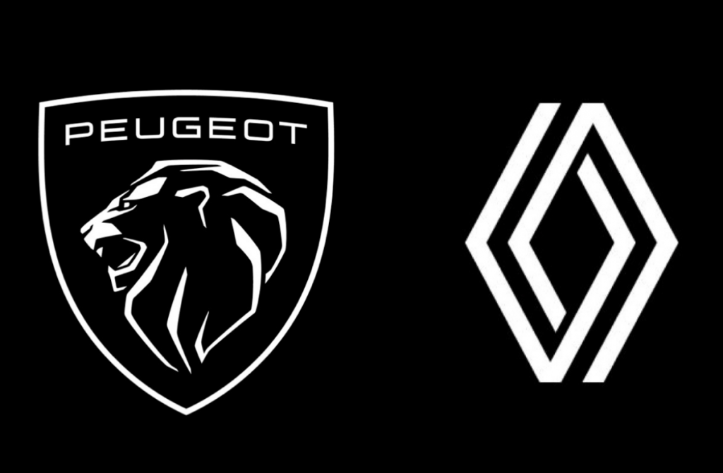
The legendary French auto makers are the latest to rebrand in the face of a rapidly changing industry.
By Mark Tungate
These are fast times for automotive design. Recently the news broke in France that two of the country’s leading automotive brands – Peugeot and Renault – had changed their logos. But as experts reminded me, the initiatives come hot on the heels of rebrands for Audi, Nissan, Volkswagen, Kia, Mini and General Motors.
There’s more behind this than a need to freshen their appeal for younger drivers. The transition from fossil fuel to electric; competition from “electric only” brands; the increasing importance of the Chinese market (and Chinese brands); the decline in car ownership, as well as a related shift in positioning from “car companies” to mobility providers – all these are having a dramatic impact.
Peugeot was more vocal about the change than its rival – perhaps because the change itself is more radical, replacing the heraldic “rampant” lion with a lion’s head in profile. (A sports fan friend of mine in the UK joked that it reminded him of the Gloucester Rugby team logo.)
https://www.gloucesterrugby.co.uk
In fact, the Peugeot design harks back to one used by the company in the 1960s. Coincidentally, Renault’s discreet new look refers to the logo designed by the artist Victor Vasarely in 1972. So it seems that automakers are drawing on their heritage for solidity in the midst of seismic changes. Automotive journalists like those at Autoevolution.com have been broadly positive about the moves.
https://www.autoevolution.com/news/upmarket-peugeot-needed-a-new-logo-here-it-is-156793.html#
One graphic designer – who preferred to be quoted off the record as she’s worked for both brands – came down clearly on the side of the Renault logo. “It’s simple, strong and dynamic. It’s timeless yet looks clearly towards the future. It scales easily, adapts to any situation, is open and flexible with good energy circulating within it. And you don’t need to write ‘Renault’ next to it.”
She had reservations about the Peugeot lion, which she felt was “busy and complex”, so perhaps less adaptable to the digital world. She also felt that it departed dramatically from the brand’s DNA. “Strategically, it puts Peugeot in a high luxury category, as the badge shape has similarities to Porsche, Maserati, Lamborghini or Jaguar.”
The logo itself was designed by Peugeot in-house, while the W agency created the rest of the new visual identity, which will be seen in digital and print communication as well as at dealerships and motor shows. The bespoke agency OPen – created for Peugeot by Omnicom – is handling a global rebranding initiative bearing the slogan “Lions of our time”. The underpinning idea is that today’s generation are less interested in earning a fortune than in “quality time” – the value of experience.
On its UK website, Peugeot confirms that its goal is to “move upmarket”. It adds: “Peugeot’s new identity asserts its positioning as an innovative high-end generalist brand. Three words sum up the new Peugeot logo: quality, timeless and assertive.”
It’s fair to say that tampering with a logo is a delicate business – the history of branding is fraught with logo changes that raised consumers’ hackles. As the pandemic has shown us, brands that people have known all their lives can be an unexpected source of reassurance amid the multimedia clutter.
Clothing retailer Gap famously pulled its new logo within a week in 2010 after an online backlash. Fruit juice brand Tropicana experienced a similarly humbling experience five years later.
Independent creative director Aaron Levin commented: “The major issue is that a branding project is systemic, holistic and each contact point is one part of the big puzzle that ends up being the brand. But most people react to the one part that gets squeezed into a media presence, usually a new name or a new logo, without the big picture.”
As the rebranding only takes on its full meaning and force through time, first reactions can be negative, he observes. “Of course, in our social media dominated communication-scape, this negativity gets blown-up way out of proportion.”
He points out that, in the digital realm, both Airbnb and Instagram got “bashed” for their rebrands: the former because people felt the new logo resembled breasts or a derriere, and the latter because users loved the vintage Polaroid look of the original version.
“But if you look at how the rebrand helped Airbnb get to a whole new level today, and look back at what their identity was before, it’s obvious they made the right move,” he says. “Same goes for Instagram. When they changed to the more abstract camera icon, people felt that they had lost their soul. But the Polaroid version worked when Instagram was just a filter that made your pictures look vintage. Instagram was transitioning to becoming a social media platform in its own right and it needed a simpler icon that could be reduced to a few pixels in the footer of a web site.”
Logos in any field do not drive change – they are driven by change. So despite their retro allure, it’s likely that the new logos soon to be affixed to the radiator grilles of Peugeot and Renault automobiles are pointing in the right direction.
MARKETING Magazine is not responsible for the content of external sites.


