Posted on by Raihan Hadi
Subscribe to our Telegram channel for the latest updates in the marketing and advertising scene
Exclusive: McDonald’s In Russia Unveils Replaced Logo Resembling Burger & Fries
10 Jun
You heard it from here first. DesignTAXI got a tip-off that McDonald’s in Russia has rebranded, ahead of a grand reopening slated for this month.
The overhaul was confirmed by Russian publications TASS and The Moscow Times, both of which cited state media.
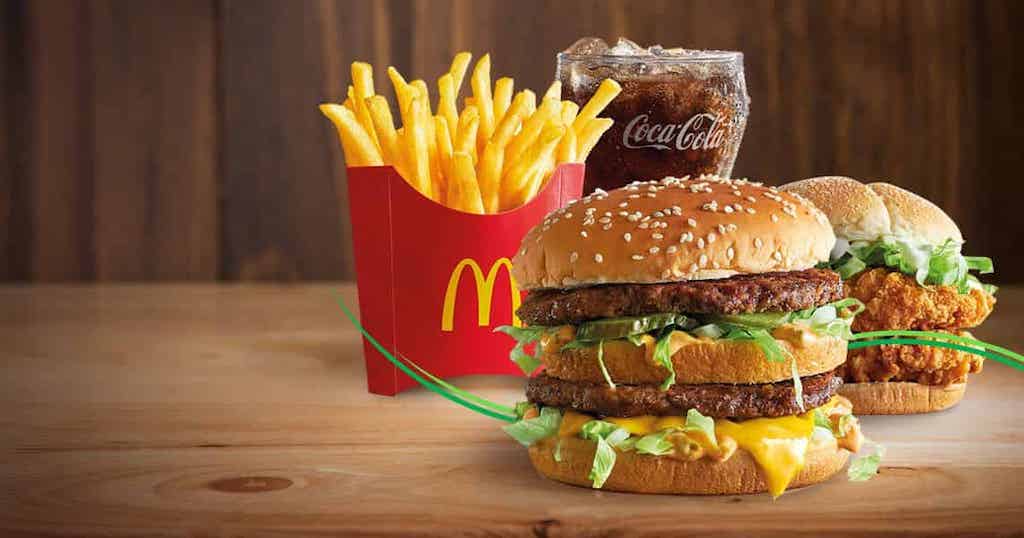
The yet-to-be-named successor vaguely pays homage to its roots with an ‘M’ monogram as its branding, though it’s not the Golden Arches by any means. The initial is made up of two French fries-like strokes and a circle representing the circle.
According to Systema PBO LLC, the new parent of the fast-food chain in Russia, the logo is encased in a green circle as a nod to the quality that fans know and love.
Новый владелец бывшей сети McDonald’s в России выбрал логотип, сообщает пресс-служба компании «Система ПБО»:
«На логотипе изображены главные символы ресторана: две палочки картофеля фри желтого цвета и бургер — желто-оранжевого. pic.twitter.com/iW2Uwg96vI
The restaurant will introduce an all-new menu in light of the original chain exiting the country, leaving behind 847 locations and a three-decade legacy in the nation. McDonald’s was sold to an existing licensee by the name of Alexander Govor.
Accordingly, the successor has not decided on a name yet, though one potential moniker it’s been considering is “Fun and Tasty.”
MARKETING Magazine is not responsible for the content of external sites.
After 20 years of evolving technology, shifting market trends, and adapting to changing consumer behaviour, the media landscape has nearly reached saturation.
We’ve optimised to the fullest, providing advertisers with abundant choices across technology, platforms, data-driven marketing, CTV, OTT, DOOH, influencer marketing, retail, etc.
Media specialists have diversified, but with more options comes the challenge of maintaining income growth. The industry is expanding, but revenue isn’t keeping pace.
Now, we’re at a TURNING POINT: time to explore and harness new sustainable revenue streams. While GroupM forecasts a 7.8% global ad revenue growth in 2024, challenges like antitrust regulation, AI and copyright issues, and platform bans persist.
Collaboration is key: partnerships that thrive on synergy, shared values, and aligned goals are becoming increasingly essential.
Hence, the Malaysian Media Conference, in its 20th year, has assembled the partners and players under one roof on October 25 for a day of learning, sharing, and exploring.
We use cookies to ensure that we give you the best experience on our website. If you continue to use this site we will assume that you are happy with it.OkNoPrivacy Policy