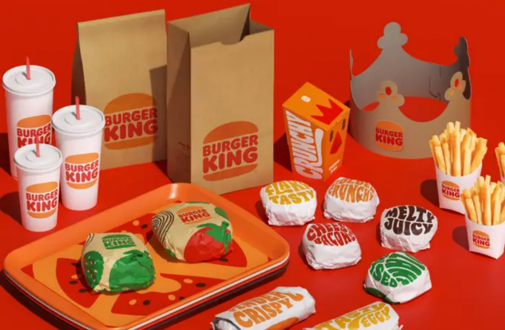
Burger King unveiled its first rebrand in over 20 years, a modernized change inspired by more realistic looking food that signal’s the brand’s evolution in food quality, sustainability and digital. The new logo part of the rebrand looks most similar to Burger King’s 1990s logo, giving its customer a sense of nostalgia.
Aside from the logo, the rebranding includes changes to its packaging, restaurant merchandise, menu, uniforms, restaurant decor, social media profile photos, digital, and its marketing assets.

By improving on their taste and quality, Burger King’s rebranding attempts to associate the fast food brand with a healthier look at their menu items using simplified artwork that looks fresher and more realistic while keeping with the brand’s bold and playful colors and font. The new logo looks most similar to Burger King’s
According to Business Wire, the rebrand’s design principles capture the unique characteristics of the Burger King brand: Mouthwatering, Big & Bold, Playfully Irreverent and Proudly True using the following elements:
Logo. Confidently, what BK is all about – real, simple and delicious food. Since launching the current logo in 1999, the industry has transitioned to a more modern, digital-friendly design language. The new minimalist logo seamlessly meets the brand evolution of the times and pays homage to the brand heritage with a refined design that’s confident, simple and fun.
Color: Selected colors are unapologetically rich and bold, inspired by the iconic Burger King flame grilling process and fresh ingredients. The new photography is hyper textured and dials up the sensorial aspect of the food.
Font. Burger King new proprietary brand font is (appropriately) called “Flame”. The font is inspired by the shapes of BK food – rounded, bold, yummy – and brand’s irreverent personality.
Uniforms. New crew member uniforms reflect flame grill masters, mixing contemporary and comfortable style with distinctive colors and graphics. Real crew members are featured in new BK advertising.
Packaging. New packaging showcases the new logo very proudly as well as bold colors and playful illustrations of ingredients.
According to Business Insider, who got a first look at the new design via a virtual tour in Miami, the rebranding at other restaurants will not be seen for a while as the company plans a prolonged integration over the next few years.
Preview Burger King’s new look here:
MARKETING Magazine is not responsible for the content of external sites.


