Posted on by Raihan Hadi
Subscribe to our Telegram channel for the latest updates in the marketing and advertising scene
Xiaomi’s mathematically inspired new logo, explained by designer Kenya Hara
05 Apr
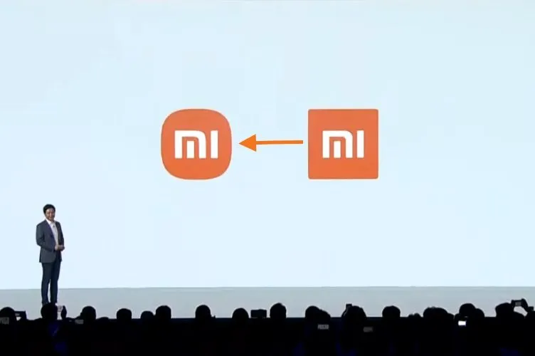
Last week, Chinese tech brand Xiaomi revealed a new brand logo. Revealed at the company’s ‘Mega Launch Event’, the logo now takes the shape of a “squircle”, swapping out sharp corners for rounded ones – represents a new image for the company, founder and CEO Lei Jun said during the event.
Xiaomi’s new logo (left) vs. the old verson (right) (Image credit: Xiaomi)
According to designer Kenya Hara, the new logo “is not just a simple design of the shape,” but rather an “encapsulation of Xiaomi’s inner spirit” as it intends to convey the essence of a single word: Alive.
Since the launch event which also revealed six new phones, two laptops and one band, the smartphone maker has become subject of social media mockery for spending three years and hundreds of thousands of dollars on a new logo that looks remarkably similar to the original.
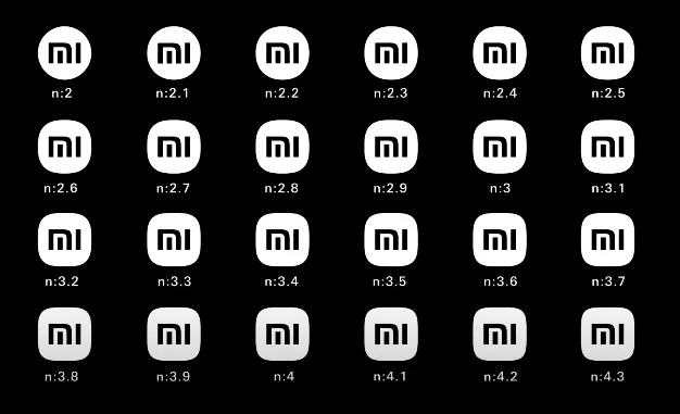
According to Hara, the design team behind the new logo used the power of mathematics to find the perfect middle ground between a square and a circle, hence the squircle). Out of twenty-four options (above), the team opted for shape n:3.
Regardless of how you feel about Xiaomi’s revamped logo, listening to Kenya describe the thought process that led to the final choice, is an experience in itself thanks to his calm, eloquent and detailed narrative.
We use cookies to ensure that we give you the best experience on our website. If you continue to use this site we will assume that you are happy with it.OkNoPrivacy Policy