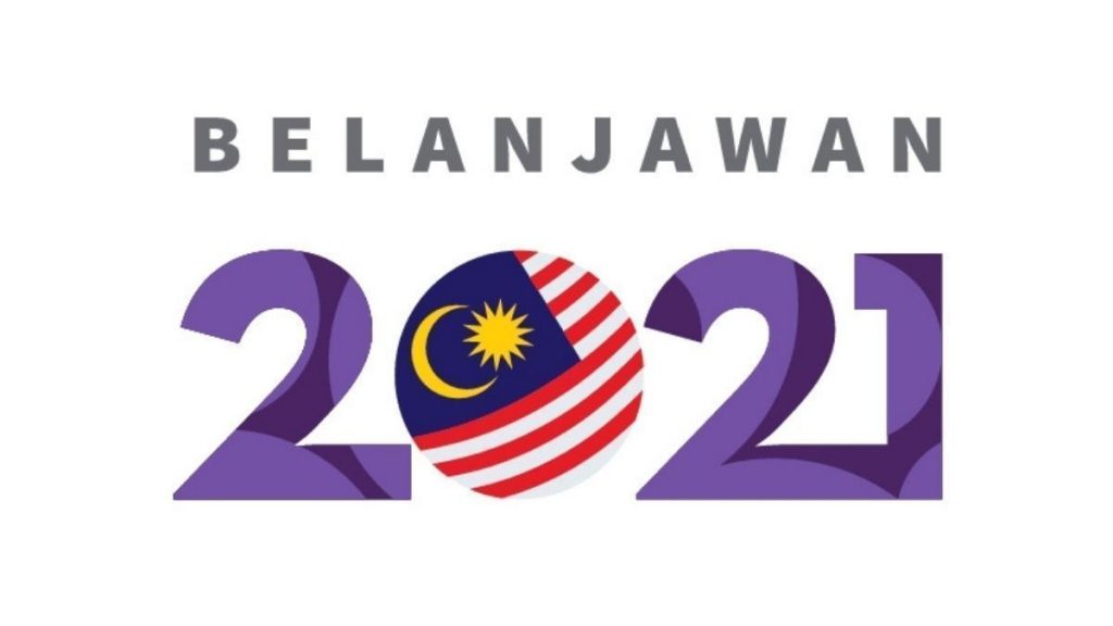
On Nov 8, Malaysia’s Budget 2021 will be announced. This important event was preceded by an even more important event recently: the announcement of Budget 2021 logo.

On Tuesday, when Finance Minister @tzafrul_aziz tweeted about the logo, netizens were immediately divided. Some felt the logo was untimely. Other felt it was untimely and unnecessary.
… As a serious investigative journalist, I didn’t want to be influenced by opinions, and instead decided to visit the Budget 2021 website to learn more about the logo…
By the time this article goes to print, we should expect at least three change.org pages demanding the rakyat shut up about the logo and duduk diam diam di rumah.
As a serious investigative journalist, I didn’t want to be influenced by opinions, and instead decided to visit the Budget 2021 website to learn more about the logo.
Rather thoughtfully, the logo rationale and usage guide were presented big and bold on the landing page- followed by frivolous details like the goals, and focus of Budget 2021 or something like that.
The fact that the logo is not shown once on the website (unless you download the Logo Usage Guide) is a moot point. We don’t need to see the work everywhere.
The Usage Guide (UG) is an important 3-page document detailing the rationale and how the logo should be used. It has to be noted that this document is 3 pages longer than the Finance Ministry’s plan of handling the current spike in cases.
The logo’s main colour is purple. Every 6-year old knows that purple is the colour associated with Malaysia, and financial matters. To drive home the point, and lest one forgets this is a Malaysian logo, the Jalur Gemilang is given due prominence.
Not only that, the flag is strategically placed where the zero should be. Some may say this is an apt metaphor of the current government’s thinking capacity but pay no attention to them.
… Is the logo as good as City Hall’s controversial Kuala Lumpur logo unveiled in 2016?…
People who are unduly worried about the rising number of Covid-19 cases, lack of PPEs and hospital beds in Sabah, economic assistance for low income groups should take comfort in the government’s adept handling of Budget 2021 logo guidelines.
That said, did we get a good logo?
If one interprets design as the ability to place small letters above a large number, then yes. We got an excellent logo. Let’s not get too picky here.
Did you notice the batik texture in the numbers? Never mind that not even batik designers would call it ‘batik’, or that the texture cannot be seen when the logo is reduced – the important thing is that we have an element that represents national unity and progress.
Is this logo as good as City Hall’s controversial Kuala Lumpur logo unveiled in 2016?
Many designers would have preferred the logo to remain veiled but to be fair, the KL logo had more meat. The latter had two taglines (significantly more than other run-of-the-mill logos) and was conceptually stronger.
For example, tagline no.2 tells people that KL is a ‘city of contrasts and diversity’ and what better way to show it than by presenting the logo in contrasting fonts and immediately creating diverse opinions, ranging from, ”It’s ugly” to “It’s nonsense” to “My grandmother can design a better logo and she’s deaf, blind and has shaky hands”.
And finally, the burning question on everybody’s mind: Is this logo as good as the first Visit Malaysia Year 2020 logo?
MARKETING Magazine is not responsible for the content of external sites.


