By The Malketeer
A Timely Reminder – Knowledge is the Key to Unlocking a Deeper Connection with the World
In a world where information is often consumed in bite-sized chunks, Scribd is taking a stand.
The user-powered library, home to over 200 million documents in 261 languages, has unveiled a global redesign that reimagines its brand as a “contemporary content catalogue.”
Partnering with independent branding studio Mother Design, Scribd’s refresh is more than just a facelift—it’s a mission to redefine how we engage with knowledge.
Founded in 2007, Scribd has long been a pioneer in the digital content space.
But as the platform evolved, so did the need for a brand identity that reflects its role as a global hub for knowledge seekers.
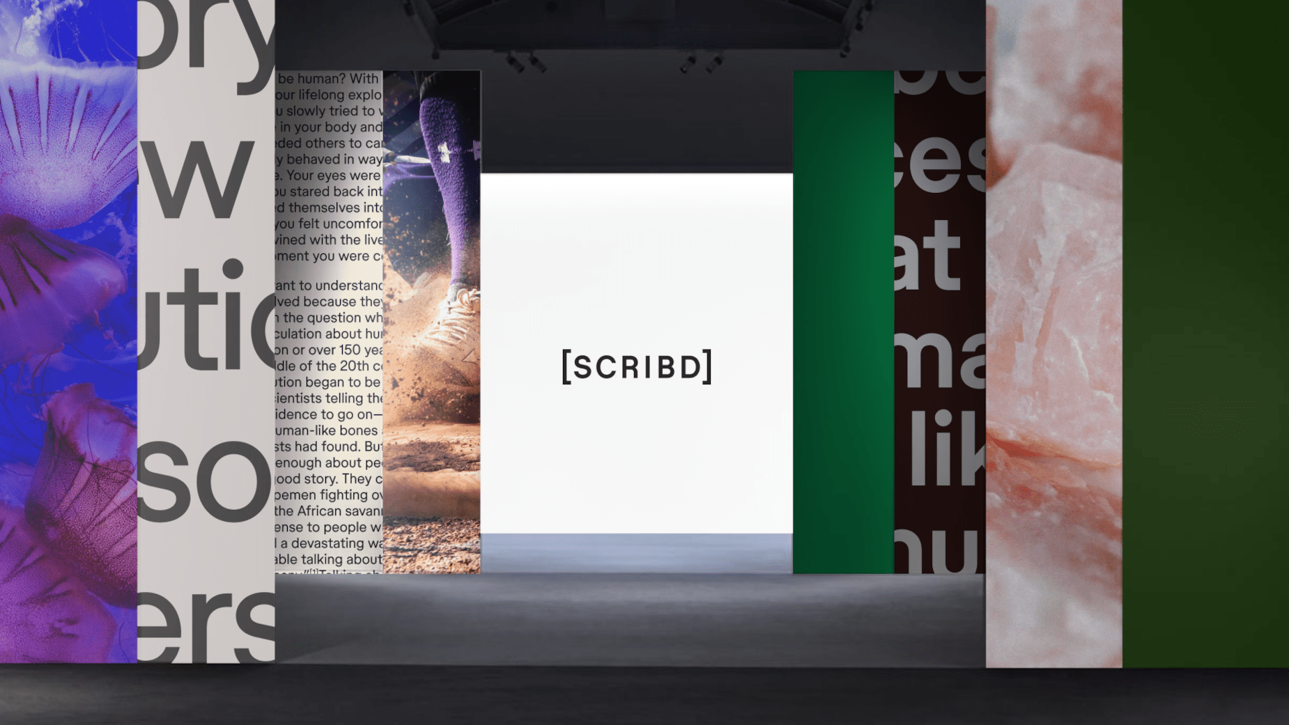
Enter Mother Design, the creative force behind the new look, which draws inspiration from physical archives and libraries.
The redesign, titled ‘The Source. Life is an essay, and we are its bibliography,’ frames Scribd as a curator of context in an age of fleeting information.
One of the most striking elements is the reimagined wordmark, now encased in square brackets—a nod to literary source lists.
This subtle yet powerful detail underscores Scribd’s commitment to being a trusted repository of knowledge.

Typography with a Bibliographic Twist
Mother Design didn’t stop at the logo.
Collaborating with Store Norske Skriftkompani, they developed a bespoke typeface that incorporates bibliographic symbols like brackets and superscripts.
This innovative approach not only optimises headlines but also reinforces the brand’s scholarly roots.
“We wanted to honour Scribd’s heritage as one of the first wave of internet brands while celebrating its evolution into a fresh, necessary destination for knowledge seekers globally. This new identity reflects our mission to democratise the exchange of information,” explains Gemma Craven, Scribd’s VP of Brand Marketing.
The redesign also introduces a refreshed colour palette, swapping out stark digital tones for soft, earthy pastels.
These hues evoke the warmth and tactility of physical archives, creating a sense of familiarity and trust.
It’s a deliberate choice to bridge the gap between the digital and the tangible, reminding users that Scribd is more than just a platform—it’s a gateway to discovery.
Deeper Understanding, Not Hot Takes
Jo Tulej, creative director at Mother Design, sums up the philosophy behind the rebrand, “We’ve created a brand positioning that encourages deeper understanding rather than hot takes. The new identity imagines Scribd as life’s bibliographer—a platform that gives people much-needed context to truly understand the big and small of everyday life.”
This focus on depth over speed is a refreshing departure from the fast-paced, algorithm-driven content ecosystems that dominate the digital landscape.
The rebrand will be rolled out across Scribd’s web platform and apps, ensuring a seamless experience for its global user base.
As the platform continues to grow, this new identity positions Scribd not just as a library, but as a vital resource for anyone seeking to make sense of the world.