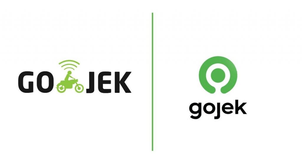
Indonesia-headquartered Gojek revealed a new logo in a rebrand to mark what the company is calling Gojek’s evolution from Jakarta-based ride-hailing service into one of Southeast Asia’s multi-service digital apps.
As part of its rebrand the firm appears to also be formally dropping the hyphen in its name, so what was previously sometimes styled as Go-Jek is now simply Gojek. The name comes from the Indonesian word for online motorcycle taxis, which are locally known as ojeks.
From its roots as a ride-hailing platform that specialized in two-wheelers, Gojek has expanded across multiple verticals, including four-wheel transport, mobile payments, logistics, and merchant services, making the company an industry leader in its home country, Indonesia.
It’s also strengthening its presence in new markets. In Thailand, through its Thai affiliate GET, Gojek has formed a strategic partnership with Siam Commercial Bank, the country’s largest lender by assets to expand GET’s financial services.
Gojek is also present in Vietnam through its subsidiary Go-Viet. In Singapore, it operates directly under Gojek.
The rebrand sets the course for Gojek’s next phase of growth, which will include further innovation and the strengthening of its integrated ecosystem of over 20 on-demand services, according to an official statement.
Gojek’s largest regional competitor Grab, which had started out as GrabTaxi in Malaysia, underwent a rebranding in 2016, when it decided to call itself Grab and drop the “taxi” from its name.
The new logo
Gojek’s new logo, a nearly-rounded ring encircling a dot, looks simpler than its previous logo that included a motorcycle taxi icon.

The new logo began its roll-out in Indonesia and Singapore today.
Gojek’s lifestyle app GoLife also has a new logo that resembles a nearly-rounded ring encircling a home icon. For GoLife, the company chose a different color palette to set it apart from Gojek’s main app.
source: http://www.kr-asia.com
MARKETING Magazine is not responsible for the content of external sites.


