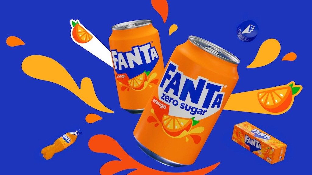
For the first time ever, Fanta has announced a global brand identity, hoping to infuse flavours of playfulness into the mundane moments of life through bright and bold designs that represent the brand’s tasty beverages.
Previously, the company had different packaging across various markets. Now, it will finally present a cohesive branding to customers around the world, following in the vein of other iconic soda brands such as Coca-Cola and Sprite.
Instead of simply marketing its drinks, the company wanted to revitalise its appeal by shifting its focus to reflecting an attitude—encouraging customers of all ages to reclaim, embrace, and benefit from the spirit of “play.”
To achieve this, the brand’s designers dreamed up a cohesive and consistent visual identity that evokes feelings of fun, with the new logo and custom typography fully embodying the “presence and personality” of Fanta.
Of course, the redesign include the bright, identifiable colours often associated with the firm’s range of flavours, which will seamlessly merge with its new graphic system and dynamic emblem to cut its way through the myriad of other sodas lining grocery store shelves.

The illustrations on the bottles, which were designed by Lucas Wakamatsu, along with photography, will help emphasise the brand’s aesthetic of mixed media, setting it apart from others with unique layering, purposeful imperfections, and storytelling through its drinks.
“We were really inspired by the idea of bringing playfulness to consumers of all ages when we started to ideate around how to bring the brand’s purpose to the masses,” explained Lisa Smith, ECD Global, Jones Knowles Ritchie.
“By thinking what this meant for the brand’s expression, attitude and actions, we were able to build a distinctive brand identity that signaled Fanta’s commitment to fun at every level—from real life to digital,” she added.
This article was first published on Design Taxi
MARKETING Magazine is not responsible for the content of external sites.


