By Mark Tungate
The design world’s extraordinary response to the coronavirus
In these uncertain times…Okay, let’s not go there. The phrase has become the mantra of the Covid-19 period. But it’s fair to say that despite (or perhaps because of) the chaos, creative folk have been more creative than ever. One agency even came up with a new font called Times Uncertain.

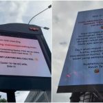
Graphic design and illustration are flourishing. Magazines such as Sports Illustrated, Bloomberg Markets and of course The New Yorker have come out with splendid covers that capture the eeriness of the isolation period. At the same time, many brands have altered their logos in clever ways to help spread the message about social distancing.


For Eliza Williams, editor of Creative Review, this outpouring of creativity was inevitable. “It’s such a huge event, affecting people all over the world, plus people are also in lockdown so it’s natural they’ll want to express themselves.”
The work itself has evolved along with the crisis, she observes. While the earlier posters or visuals tended to express safety messages, more recent designs have been about treating people with respect. “I particularly liked the selection of posters put together by VCCP for the British Red Cross, which feature designers like Anthony Burrill and Supermundane.”


She also highlights the vital role that data visualization has played. “The first things I shared were infographics from Information Is Beautiful, which people seemed to find helpful before quarantine as a way of understanding the magnitude of what was going on. It was interesting to note how helpful design could be to express complicated information in a useful way.”

In the UK, Eliza adds, a more political element is starting to emerge in the designs and messaging. “Both Craig Oldham’s poster for key workers, and another work by Jeremy Deller, which talks about the role immigrants play in the UK, have a strong political element to them.”

Meanwhile, on the other side of the Channel, Aaron Levin, creative director of French design agency Curius, observes that we’ve not seen the emergence of one strong design element that sums up the fight against Covid-19 worldwide (in the way that Extinction Rebellion has its iconic hourglass). In fact the mask has become the symbol of the period.
There is another candidate from Japan: a typically charming sea creature called Amabié, with a folkloric back story.

Aaron also has thoughts on the graphic representation of the virus, which recalls the spiky AIDS virus. “There is something inherently menacing about the design aesthetic of these viruses. Or is it just our imagination, because of what we know about them? I tend to believe that ‘form follows function’. It is spiky because it is made to penetrate the defenses of a system, hence it has developed the best possible shape to do that.”
Aaron has two picks for effective design. “The first one was when Olivier Veran, France’s Health Secretary, drew that simple diagram that explained flattening the curve and avoiding overwhelming healthcare capacity. Two simple curves and a dotted line, drawn by hand on a piece of paper and you got it. I suppose this drawing was shown before by other people, but that was the first time I saw it and had a Eureka moment.
“The second one was the interactive Washington Post piece that showed the effect of different social distancing strategies with little colour dots. This is information design at its best, and it went on to become the most shared article in the history of the Washington Post.”

The two examples show the power of design, he concludes. “You can change the course of the Vietnam war by publishing a picture of a young naked girl running from napalm, but you can also change the response to a deadly pandemic by drawing a simple diagram on a piece of paper.”
MARKETING Magazine is not responsible for the content of external sites.


