Looking back at a digital design challenge.
Urban transport systems of all kinds play an oversized role in my life. That’s because my ten-year-old son is a transport geek, so his room is plastered with posters of subway maps and bus routes. Whenever we visit a new city, the first thing he wants to do is ride the metro – or tram, or whatever conveyance is available.
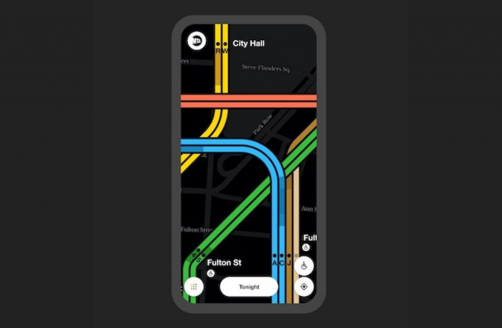
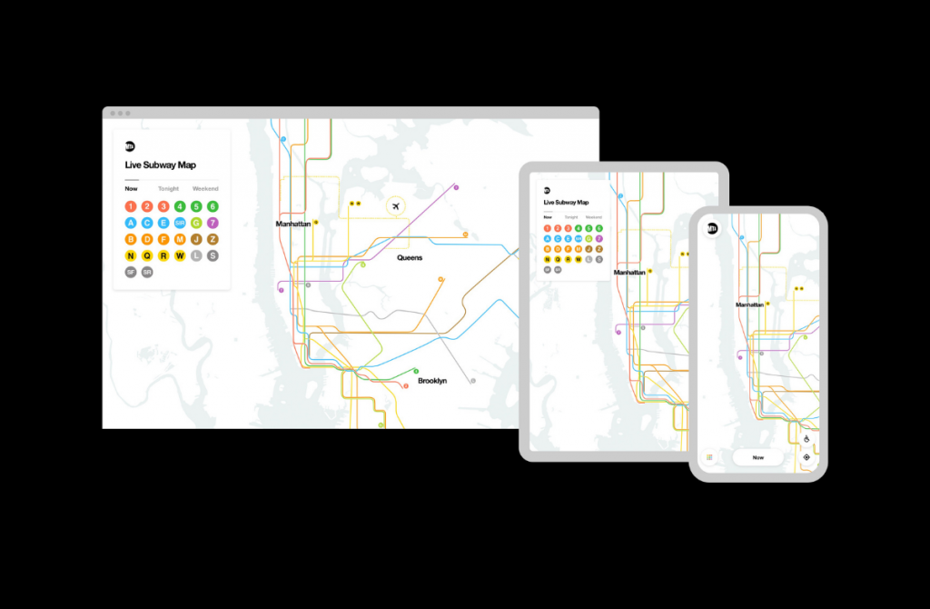
So when I was scrolling through the Cannes Lions winners earlier this summer, my attention was immediately hooked by the MTA Live Subway Map, which won a Gold in Digital Craft. The New York subway in real time, on your phone? I must have been channelling my son’s energy, because I thought it was the coolest thing ever. For him – and for me – I knew I had to chat to the agency behind it.

A couple of emails later, I was on the phone with Felipe Memoria, co-founder and design partner at Work & Co in Brooklyn. Felipe led the map project, although it embroiled many others. I was also curious to learn more about this rather unusual agency.
Recalling the outfit’s origins, Felipe says: “I always felt there was a space for a digital product shop – a shop that focused only on designing and building digital tools. At the time, the trend was towards full-service agencies, which is kind of still the case. There’s nothing wrong with adding services in order to attract more clients and grow, but I thought the counter-strategy of being really good at one specific thing had a lot of merit.”
As he’s from a family of architects, he adds, he was personally attracted to the idea of crafting products people use on a daily basis. Founded in 2013, Work & Co has expanded beyond its Brooklyn base to Portland, Copenhagen, Belgrade, Rio (Felipe’s home town) and São Paulo, with a total staff of around 420.
From static to reactive
Talking of things people use every day, let’s return to the digital subway map. How did the agency get involved? Did the MTA (it stands for Metropolitan Transportation Authority) hold a pitch?
Felipe says the story began when Sarah Meyer started there as chief customer officer. She quickly realized that the subway needed a digital solution. As it operates 24 hours a day, seven days a week, there’s no downtime for repairs or maintenance. These are carried out during off-peak hours or at weekends, but still require closing lines and re-routing trains. As Felipe puts it, “The map of the subway is in constant flux.”

Prior to the digital map, this information was mainly communicated to travellers via…printed notices in subway stations.
Dismayed, Sarah Meyer reached out to the Transit Innovation Partnership, a public-private entity launched by the MTA and the New York business community “with the mission to make New York the global leader in public transit”. Its former executive director, Rachel Haot, began researching the subject within the design community – and the track led to Work & Co.
“We’re known for our passion about this,” says Felipe, who’s long been inspired by great subway map designers like Massimo Vignelli and (in London) Harry Beck. “Every year when we asked our colleagues about their dream client, the MTA was always top of the list. I don’t know if they spoke to other agencies, but when we heard the brief, we knew it was for us. They told us that it had to be pro bono – they really couldn’t pay us a cent – but we told them they’d come to the right place, because we were obsessed by the MTA and we couldn’t wait to work on something inspired by these great designers.”
A quirk of the subway map’s history is that there have been two iconic versions. The one designed by Vignelli in 1972 was conceptual and non-geographical – like the London Tube map – but while it was visually stunning, passengers disliked the fact that it was an abstract diagram, with no above-ground reference points.
So in 1979 it was replaced by a geographically realistic map, which included landmarks and street names. As this short film explains, Work & Co’s elegant digital design incorporates both solutions: closer to reality when you’re zoomed out, more diagrammatical as you zoom in.
“Technology has given us tools that the design masters of the past didn’t have access to,” Felipe remarks. “We built on top of their work – we’re standing on the shoulders of giants.”
A moving story
The biggest challenge was creating something that always looked like a definitive map, even though it was live and constantly changing. “The MTA already had the data – the content – at its fingertips, but it would use it in a static way as printed notices. We created a powerful visual representation that evolves in real time.”
A key design decision was to incorporate the Google Maps-style blue dot so people can locate themselves in the system. But the most fun elements of the live map are the moving trains – which my son finds enchanting.
Felipe says: “First of all they’re useful, because you can see when your train is about to get to the station. But secondly they really communicate that the map is ‘live’. In earlier versions I showed to people, the map looked so static that they couldn’t see any difference from the traditional map. And finally, the moving trains are delightful. They add some flair.”
The live map launched last October at a press conference in a downtown Manhattan subway station, where Felipe himself gave a demo. The film by Gary Hustwit, known for his previous design-related documentaries, went online the same day. “The story went viral – people are really interested in New York and its subway system. The reception was better than we could have ever hoped for. Even Twitter, which can be a battleground, was widely positive. By its very nature the MTA often gets criticized, so they were delighted.”
Since then the map hasn’t stopped evolving – for example, the addition of a Vaccine Finder feature has helped many New Yorkers find a convenient vaccination location.

An obvious question: any plans to take the map to other cities? “From the very beginning we thought of it not just as a solution for New York, but for the world. Just like Harry Beck’s London Underground design became a paradigm for other cities, we hope we’ve created a new paradigm. Let’s just say we’re having some conversations. We’d also one day like to make this an open source project.”
With the map up and running and Cannes Lions 2021 in the past, I’m wondering what Work & Co innovations could score some metal there next year (and perhaps at this year’s Epica Awards)? Felipe draws my attention to a project for Gatorade: the Gx Sweat Patch and app. In short, when an athlete scans the patch after a workout, it creates a “sweat profile” that allows the app to give advice on hydration, nutrition, training routines, recovery times, and a host of other information. “It helps you understand your own body, because everyone is different.”
It does indeed sound like an award-worthy project. But Felipe points out: “We’re a product shop, so it’s not as if we’re producing award winners on a daily basis. Our focus is on building really useful tools.”
MARKETING Magazine is not responsible for the content of external sites.


