This piece was first published in MARKETING WEEKENDER Issue 356
No, we’re not talking about the online used-car trading company.
Many aren’t aware that Malaysia has three Unicornstatus companies, and one of them is EDOTCO Group, the world’s sixth largest telecommunications infrastructure services company.
With a presence in nine countries, from Pakistan in the West to the Philippines in the East, EDOTCO ensures millions of people get uninterrupted connections to digital networks through its 54,000 tower infrastructures.
Established in 2012 as part of Axiata Group, its presence to the wider audience is not as visible as its sister companies like Celcom and Boost due to the nature of its business as a B2B company. With the unwavering vision to become a global Top 5 company in 2024, EDOTCO needed a transformational shift to chart its brand strategy and strengthen its global brand positioning in the next decade.
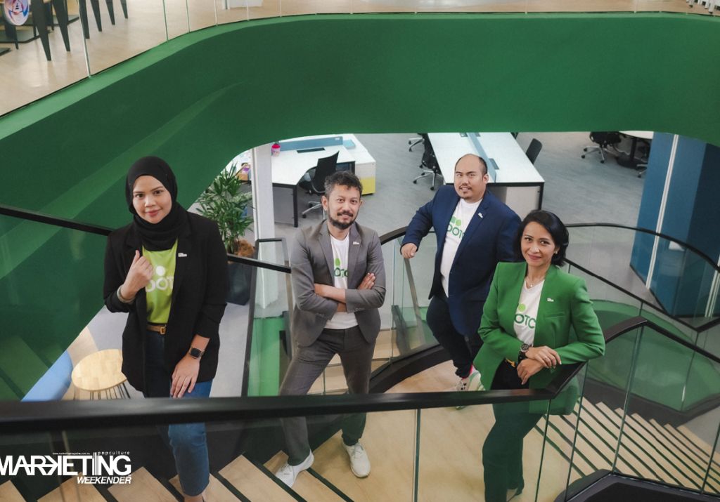
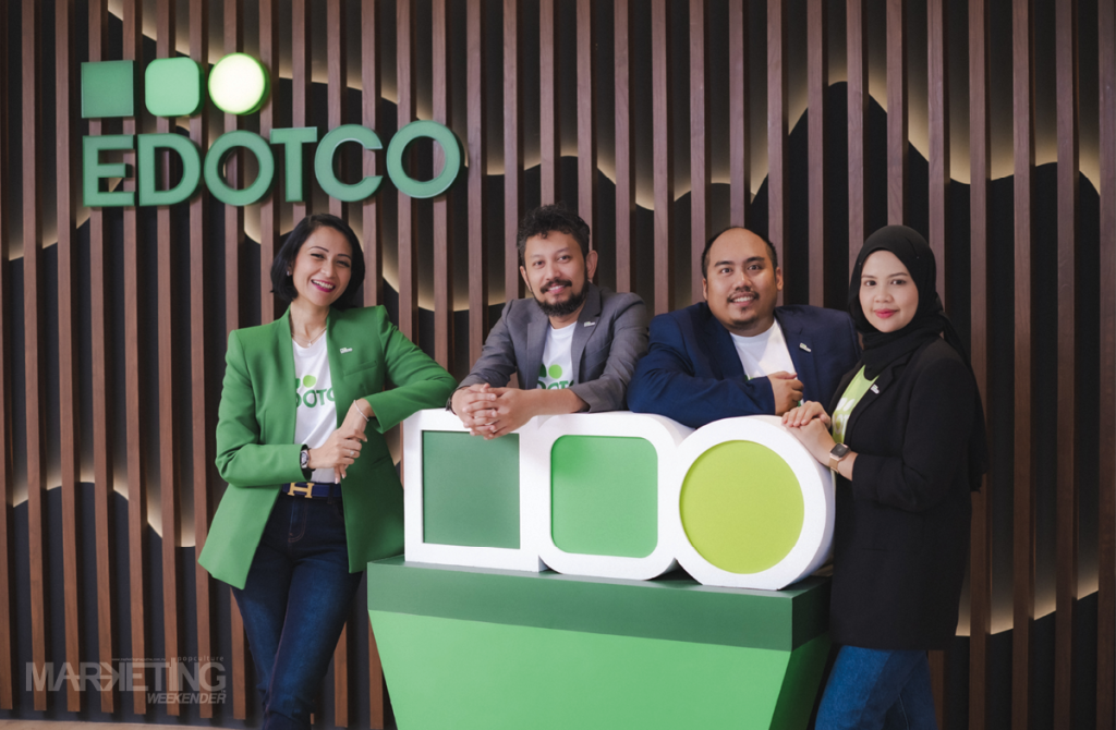
This huge calling led the organisation to appoint Noreen Sabrina as the Group Head, Corporate Communications and Branding in September 2021. Her mission – to drive the change and elevate EDOTCO’s brand and reputation for the next milestone!

Noreen brought over 18 years of experience in branding and communications, which included leadership and advisory roles within organisations such as MRCB, the Ministry of Communications and Multimedia Malaysia, MDEC and HSBC. She has worked on corporate rebranding, developed award-winning nationwide campaigns and actively judged several local and regional marketing and branding award programs.
Whilst preparing for our sitdown with Noreen, we caught up with her team members, who gave us a glimpse of Noreen as a leader. Let’s just say there were not enough words to describe this dynamite. These strong testimonies endowed us with greater intrigue as we spent the morning with Noreen at Laman EDOTCO, the organisation’s new global headquarters. We learned more about the organisation and its future.


What brought you to EDOTCO, and what were the first few things you did in your first months?
EDOTCO is Malaysia’s bestkept secret. I was a stranger to the brand before meeting the CEO, Adlan Tajudin. All that changed after speaking to him for an hour or so. I was astounded to learn that it is the first independent tower company in the region. The company’s culture is anchored on championship principles, and the drive for innovation made EDOTCO the world’s first Bionic Organisation that will supercharge the future workforce.
The aspiration, culture, and passion for empowering nations’ digital connectivity brought me here. And I can confidently say that EDOTCO is THE place to be!
While curiosity and hunger for growth kept me going, my journey was not without challenges. My first few months were focused on understanding the gaps and defining the roadmap to build our brand as the Next-generation Tower Company on a regional and global level.
My energy was spent on assembling a strong foundation. I then hired critical roles to build the team’s capability to support a strong execution.
What inspired you to rebrand EDOTCO? Why change a well established identity?
A brand should be an accurate representation of the business and define how a company should be perceived. In my first month, I saw clearly that people had problems recognising our company name by looking at the logo (e.co). We were frequently associated with household cleaning products at that time!
There was a mismatch between how people perceived us through our brand and what we believe in as an organisation. Many people could not easily relate to us – they didn’t understand who we were as a business, our industry and our role as a key enabler to the nation’s digital ambitions. And we knew we needed to educate the public on who we are more simplistically.
EDOTCO is now number 6 globally in our industry and is one of Malaysia’s homegrown unicorns. This changes our playing field. The change has also become necessary to chart our next decade and make a memorable, impactful impression on the stakeholders. Our brand must represent our growth, values, and the worldclass quality the stakeholders expect from us.
EDOTCO is a B2B company. When we think of rebranding, we often think of B2C companies investing millions in a new name or logo. How is this different?
B2C companies are transactional with short sales cycles, and the brand relationships are direct with the buyer. While B2B relations are with other organisations, sales cycles tend to be longer, and purchases are based on many factors, often involving more than one person within the customer’s organisation or externally.
In our case, EDOTCO’s ecosystem includes the customers, regulators, policymakers, and local authorities, to name a few. Brand stickiness is imperative to build our awareness amongst these target stakeholders.
With the internet and digital transformation, we have seen some changing trends in B2B sectors. The internet has changed how our customers and stakeholders became informed; therefore, our approach has become more like the B2C experience.
To remain competitive and continue our growth, we need to look at rebranding from a 360 point of view. While the logo is the starting point, our efforts surely did not stop there. We ensured that the refreshed brand was embedded across all corners of EDOTCO.
What was your approach to the new brand identity, and what does it represent?
We started with an exercise to rediscover our true purpose. What we found was simple – EDOTCO’s role in this industry is to empower the nations we are in and support our customers today and in the future. Not just to cater to the changing demands but to shape how the digital future manifests.
Our brand design principle is based on the concept of ‘debranding’ – a definitive step away from complicated designs – like how other big brands have evolved – Hugo Boss, Intel, Mastercard and many others. It cuts all the clutter, provides clarity, and makes the brand bolder, simplistic, and motiondynamic to cater to the digitalfirst world.
The three shapes (called ‘The Ellipsis’) is our unique dynamic icon that represents ‘what’s next’ and ‘connection’, effectively communicating our brand purpose, ‘Shaping Future Connectivity’. The unique ellipsis represents three shapes evolving in specified steps toward the future – starting grounded and solid as a square, ending as agile and nimble as a circle.
After being in business for 10 years, did you encounter any resistance to changing things?
I was actually surprised at how smoothly that part of the process went. Any resistance we encountered was quickly overcome once they understood the reasoning and business strategy. In fact, everyone was looking forward to the change, including our shareholders, the management team and our employees.
What challenges did you face in executing the rebranding initiative for EDOTCO?
It was a race against time for the team and I. We knew from the start that we wanted to unveil the new brand around our tenth anniversary on 30th October. So, every step of the process was done at triple the speed.
To add to the pressure, we were also working on renovating our new global HQ concurrently, which requires branding input.
We have to also factor in the internal launch before it is unveiled externally. We have to repeat the rollout in 9 countries and communicate to more than 1,500 employees based in multiple locations around our footprint markets. We were also working on our new website with new narratives, content and design. It was a crazy, crazy time.
Given the intensity, my team and I engaged an extended “army”, as I like to call it. We acknowledged that we had a mammoth task in our hands, more than what a four-people team could handle on our own.
We needed an army of people to see this through successfully. So, we worked with our partner agencies (Redhill Asia, Dragon Rouge and Suria Lab), who not only supported the execution of this rebranding but, most importantly, understood the strategic direction and roadmap that my team and I had developed.

How has the new branding been received? How do you think the new brand affects EDOTCO’s position moving forward?
Our stakeholders, customers and employees really seem to love the new brand. Many people feel like we’re a different company than we used to be. The reality is that the new brand identity uncovered our internal culture externally. We have always been a dynamic, forwardlooking, innovative organisation, and the new brand is able to accurately portray this… It’s like we broke the shell that used to cover our true selves.
The refreshed, bolder and dynamic new brand identity, together with our new vision and redefined narrative, will position us as the class leader of our industry in the region. We are now CAPITAL, which will give us recognition in any medium we present.
Overall, we are incredibly pleased with how well the rollout and response have been.
MARKETING Magazine is not responsible for the content of external sites.


