By Kunal Sinha
50% of those posting about tariffs on social media can’t even spell the word correctly.
Did that get your attention? Is that an easy data point to remember and throw around? Yes and yes.
Take a look at the screenshot of a WhatsApp group where tariffs were being discussed. I’ve provided evidence, so it must be true!

Truth be told – it isn’t. I just made up the 50% number to make it sound real.
The use of data to give credence to what we say is widespread.
Today, whether you’re a marketer, technocrat, academic, politician or journalist, finding a data set to support your point of view or debunk someone else’s is no longer a challenge.
As charts and figures swirl around us, take a moment and ask if:
Here’s one example of data fallibility – bear with me for the statistical technicality.
A study by Universiti Malaysia Terengganu (UMT) found that using a geographically weighted regression (GWR) model was better than a multiple linear regression (MLR) model to analyse crime rates in Peninsular Malaysia.
The GWR model showed a significant correlation between violent crime and non-citizen rates (% of outsiders) in 30% of districts, while the MLR model did not. This highlights the importance of local relationships in crime, which the MLR model failed to capture.
There’s also the phenomenon of innumerate folks who use data to show off that they are knowledgeable. A researcher friend narrates conversations with CMOs where she asks, “Would you prefer a 60% accurate prediction from a sample of 5 million or a 95% accuracy from a 10,000 sample?” Most prefer the 5 million sample, overlooking the 40% inaccuracy.
Seeking safety behind numbers.
Just as you can find the data to justify your stance, the data deluge makes it possible to find correlation between completely unrelated phenomena.
Such as the Coca-Cola company’s stock price and Google searches for ‘my cat scratched me’.
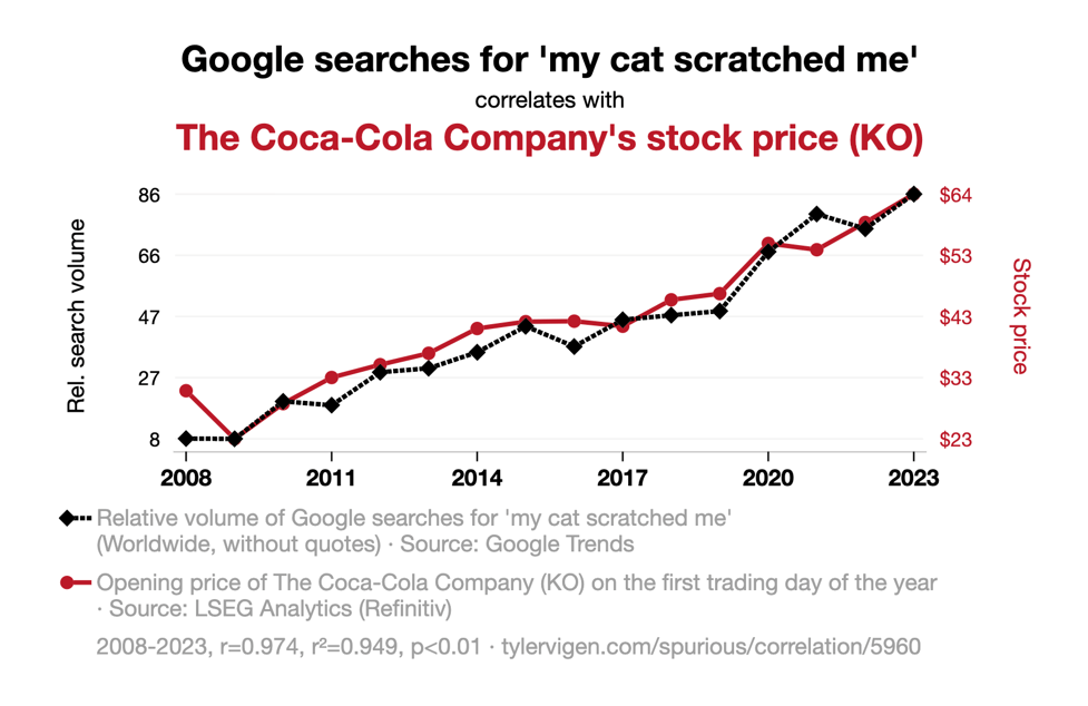
What could explain this correlation?
ChatGPT had this explanation.
As Google searches for ‘my cat scratched me’ went up, more people began to seek out the comfort of a cold, fizzy beverage. This led to a surge in demand for Coca-Cola products, ultimately driving up The Coca-Cola Company’s stock price. It seems like even feline antics couldn’t scratch the surface of Coca-Cola’s success!
Let’s look at another correlation: between the number of robberies in Alaska and professor salaries:

What could be a possible explanation?
As robberies decreased in Alaska, the demand for security systems also decreased, leading to a surplus of security devices. This surplus put pressure on the manufacturing industry, causing companies to cut costs.
Since many of these companies also happened to be major university donors, they had less funds available to contribute to professor salaries, ultimately leading to a nationwide decrease in pay for educators.
This just goes to show that even the most unexpected trends can have a ripple effect on our economy and day-to-day lives. Remember, a safer Alaska could mean a lighter wallet for your favourite professor!
The above two examples are just examples of how completely bizarre conclusions can be made through the use of data.
Despite such hilarious analyses, marketers, policymakers, journalists are all scrambling to find patterns in the data and make predictions.
Like who would be the next winner of the reality TV show ‘The Bachelor’.
The folks at Vice Media analysed over 530 contestants and winners (mostly from the US) over over a 15-year period, to try and predict the winner’s profile.
They found that 33% of the contestants on The Bachelor hailed from the West and 31% from the South, which is disproportionate to the actual percentage of the US population breakdown by region.
According to the US Census, approximately 23% of the population currently resides in the West, and 37% in the South. The winners are even more disproportionate, with 42% of the winners being from the South.
The average age difference between the Bachelor and the winners is 5.3 years – with the average age of the contestants being 26.2 years.
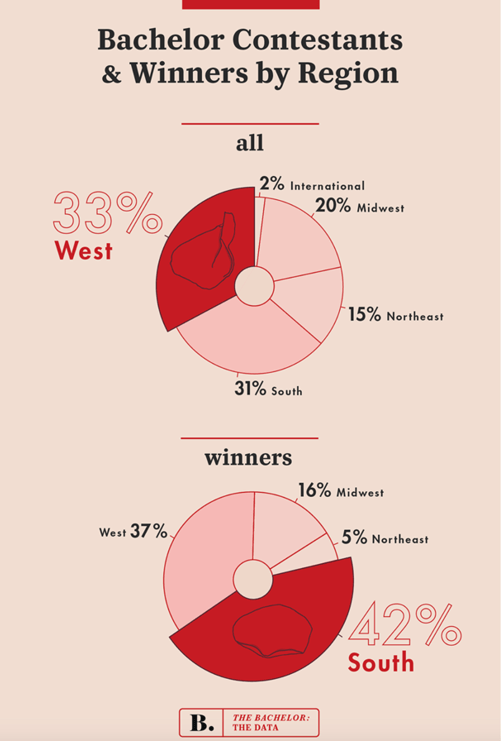
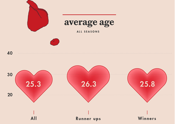
Further analysis of hair and skin colour led the analysts to predict the winner to be white, blonde, from the southern US and 5 years younger than The Bachelor.
How’s that for stereotyping?
In their urge to visualize the data, researchers and analysts often make a mess of their charts. The graphic below was created by an agency called Blueberry Labs and shows the most common colours used by brands.
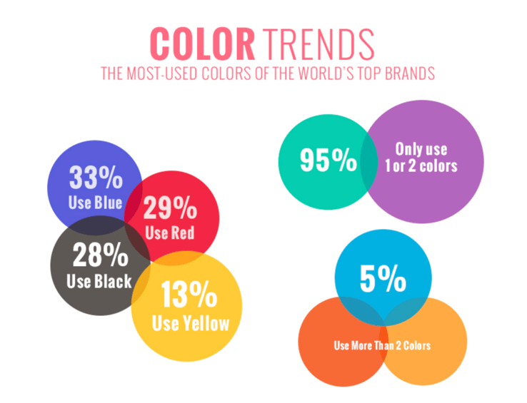
Unfortunately, they ended up creating a confusing visualization which has two core problems.
First, the size of the bubbles have no relationship with the values within them (e.g. why is 13% bigger than 28%?). Second, the overlap of the bubbles creates an unintentional venn diagram which is misleading.
The latter issue might sound like I’m being picky but they are showing relational data, so when we see the bubbles overlap, some questions pop up. Like, is the overlap showing us another relationship, does the overlap of red and yellow show us the % of top brands that use orange?
Again, it might sound like being overly picky here but they have chosen to visualize this data in a graphical way and have employed design choices that have very specific meanings in other applications.
So if you going to use bubbles that contain a value and have them represented in different sizes, then make the size relative to the value. If you’re going to use semi-transparent overlapping bubbles that have zero relation, well, just don’t.
We often see news channels represent data that completely distort electoral margins, and for a non-data literate viewer, it changes the meaning.
Here’s another example where the x-axis is stable but the y-axis is questionable, to say the least:
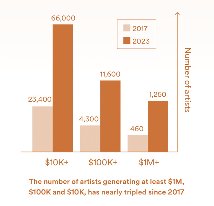
So, the next time a leader – business or political – shows you a data chart, do yourself a favour and question it. Bad data (and its representation) can indeed be consequential.
Kunal Sinha is Chief Knowledge Officer at Ampersand Advisory, based in Kuala Lumpur, Malaysia. He is the author of several books including The Future of India’s Rural Markets and Raw – Pervasive Creativity in Asia.
A version of this article appeared in www.mxmindia.com on 7 April 2025
Share Post:
Haven’t subscribed to our Telegram channel yet? Don’t miss out on the hottest updates in marketing & advertising!