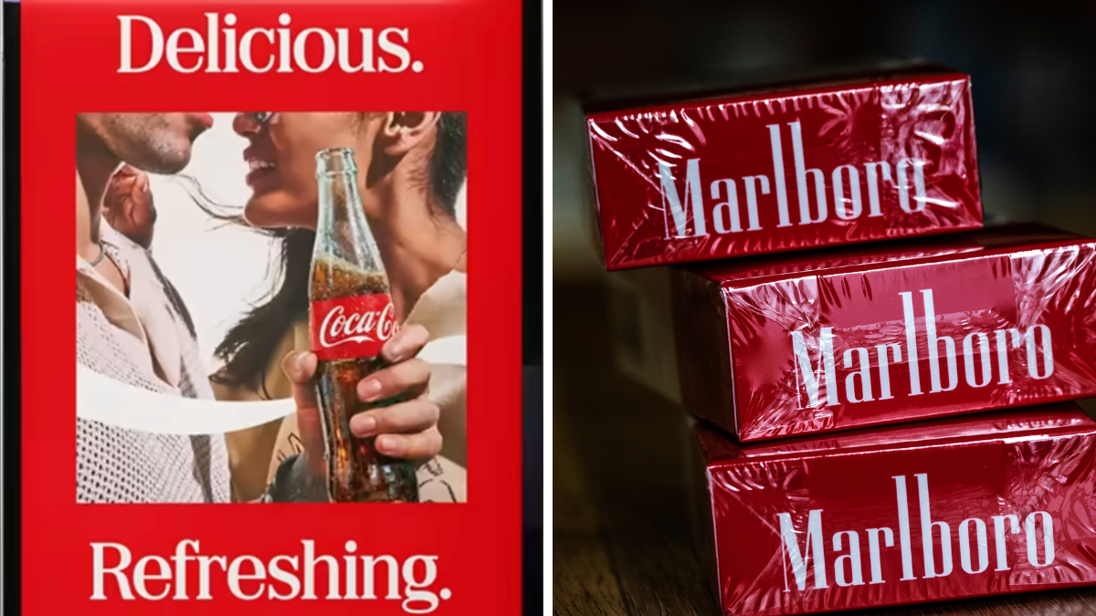
Coca-Cola changed a typeface. The internet reacted as though somebody had tampered with a national monument.
That, perhaps, is the real story behind the controversy surrounding Coca-Cola’s refreshed global visual identity system.
Developed with design agency JKR, the new system tweaks some familiar Coca-Cola assets, including its celebrated Spencerian script and dynamic ribbon. But the element attracting the loudest reaction is a complementary slab serif typeface called Better With.
Rendered in Coca-Cola’s unmistakable red and white, the typeface immediately reminded some consumers of another extraordinarily famous brand.
Marlboro.
Social media quickly filled with references to “Marlboro soda”, while commentators wondered how a company with Coca-Cola’s enormous brand resources could end up looking even remotely like one of the world’s most recognisable cigarette brands.
Technically, the criticism is questionable. Marlboro uses its own proprietary typography, and there are structural differences between the two typefaces.
But branding has never been governed entirely by technicalities. Consumers do not carry typography manuals around in their heads. They carry memories. And memories are far more powerful.
The Brand Is No Longer Entirely Yours
Coca-Cola’s latest experience illustrates one of the uncomfortable realities facing custodians of famous brands.
The more successful your brand becomes, the less freedom you have to change it. A start-up can change its logo, colours, typography and positioning almost overnight. Few people will care.
Try doing the same thing to Coca-Cola. Or Nike. Or McDonald’s. Or Apple.
The elements surrounding these brands have accumulated meaning over decades. Their colours, shapes, sounds and typography become embedded within popular culture.
Eventually, consumers begin behaving almost like shareholders in the brand’s identity.
Not financial shareholders. Emotional shareholders.
This is why apparently minor design changes can provoke disproportionately large reactions.
People are not necessarily defending typography. They are defending familiarity. And familiarity is one of branding’s most valuable currencies.
Design Lives Inside Memory
The controversy is particularly interesting because Better With is not actually new.
According to ADWEEK, Coca-Cola previously used the typeface in holiday marketing in 2023 without attracting anything resembling the present backlash.
So what changed? Context.
Put a particular typography treatment alongside Coca-Cola’s red-and-white palette, give it greater prominence within a global identity system, and suddenly another cultural reference becomes activated.
Marlboro. That is an important reminder for designers. A font never appears alone. Neither does a logo.
Consumers experience combinations of colour, scale, typography, photography, packaging and cultural memory simultaneously.
Designers may see individual assets. Consumers see the whole picture. Sometimes the picture reminds them of something you never intended.
That is where brand semiotics becomes brutally practical. Similarity does not have to survive a forensic design comparison. It merely has to trigger recognition.
We Have Seen This Movie Before
Corporate history is littered with redesigns that underestimated the emotional ownership consumers felt towards familiar visual assets.
Tropicana famously redesigned its packaging in 2009 and quickly returned to its previous design following consumer backlash.
That same year, IKEA’s move from Futura to Verdana angered design-conscious customers. Gap introduced a radically different logo in 2010 and withdrew it within days.
More recently, Jaguar’s dramatic 2024 reinvention generated fierce criticism as the carmaker abandoned many of the visual conventions associated with its heritage.
The lesson is not that brands should never change. That would be disastrous. Brands that refuse to evolve eventually become museum exhibits.
The lesson is that distinctive brand assets are not decorative accessories. They are repositories of memory.
Change enough of them simultaneously and consumers can feel as though somebody has walked into their childhood home and rearranged the furniture without asking.
The Malaysian Test
There is a useful lesson here for Malaysian marketers too. Imagine changing the visual language surrounding Milo, Maggi, Petronas, Maybank or AirAsia overnight.
The reaction would probably extend far beyond the design community. Because these brands occupy cultural territory.
They appear in childhood memories, family routines, sporting events, festive celebrations, mamak conversations and everyday life.
Their identities belong partly to corporations.
But psychologically, they also belong to consumers. That is why heritage brands must approach redesign differently from young brands.
Before asking whether something looks contemporary, marketers should ask a more important question:What memory are we about to disturb?
The New Job of Brand Guardians
Coca-Cola will survive a typography argument.
Its brand is far too powerful for anything resembling an existential crisis over Better With. But the episode reveals something significant about modern brand management.
Today, every redesign is launched into a giant global focus group called social media. Millions of people can compare, mock, remix and reinterpret a design within hours.
Once somebody says “Marlboro”, everybody suddenly sees Marlboro. That makes brand stewardship more complicated than ever.
Designers must not only understand what their work communicates. They must anticipate what it might accidentally remind people of.
Because in branding, perception frequently beats intention. Coca-Cola may own the trademark. JKR may have designed the system.
But the reaction belongs to the public. Perhaps that is the strange reward for building one of the most recognisable brands on Earth.
After more than a century of living in people’s refrigerators, restaurants, cinemas, memories and advertising, Coca-Cola is no longer simply something consumers buy.
It is something they feel they own. Change the typeface and you discover just how much.
Share Post:
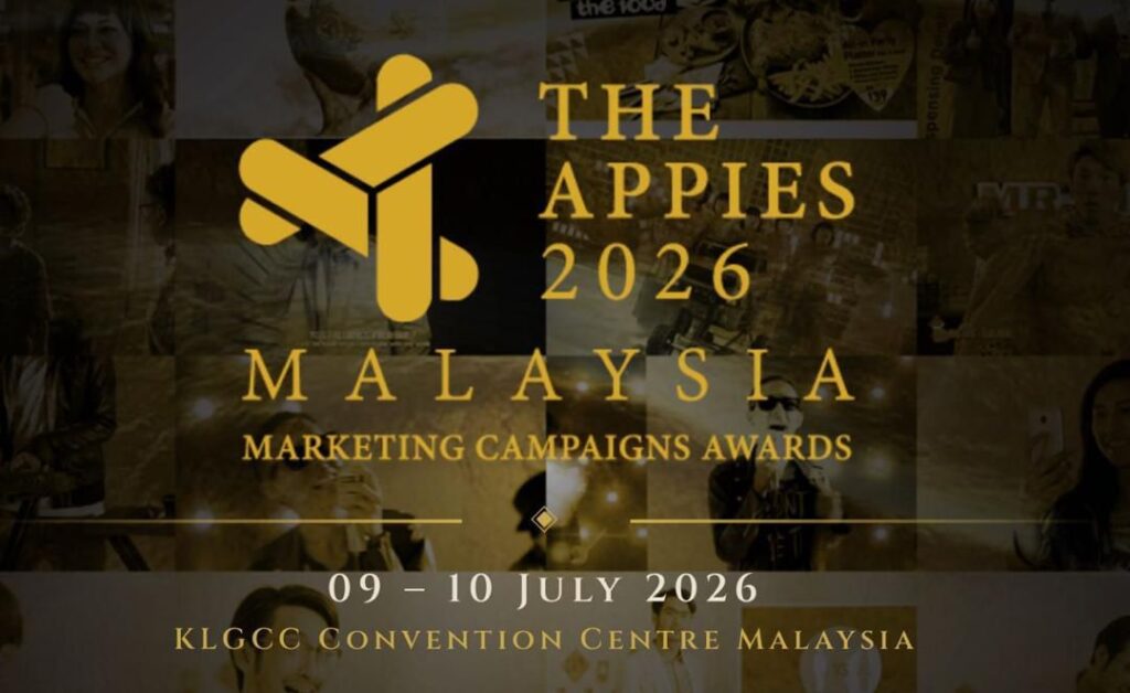
The APPIES is where Malaysia’s boldest campaigns, brightest ideas, and most impactful storytellers take the stage.
More than an awards show, it is the industry’s ultimate platform for creative, media, digital and marketing excellence, where live presentations meet live judging.
This is your chance to showcase work that moved audiences, shaped conversations, and delivered real results.
From breakthrough brand campaigns to innovative digital experiences, the APPIES celebrates the work that defines the future of marketing.
Step into the spotlight alongside the industry’s leading agencies, brands, creatives, strategists and changemakers.
Whether you are aiming for Gold, Silver, Bronze or the prestigious Best of the Best recognition, this is your moment to make history.
Your campaign deserves to be seen.
Your ideas deserve the stage.
Your work deserves the legacy.
KEY DATES
Haven’t subscribed to our Telegram channel yet? Don’t miss out on the hottest updates in marketing & advertising!