There is a particular kind of honesty that only nature affords.
Trees don’t posture.
They don’t chase relevance.
They don’t refresh their look every few years because a trend deck says so.
They grow, quietly, patiently — and when they work, they work for decades.
Which makes it quietly fitting that Tree Aid, an organisation that has spent nearly forty years helping communities across Africa build resilient livelihoods through trees, has chosen to rethink its brand not as a cosmetic exercise, but as an act of alignment.
The new identity, created pro bono by forpeople, does not shout for attention.
Instead, it listens.
To landscapes.
To communities.
And, quite literally, to trees themselves.
At the heart of the rebrand is a deceptively simple idea: when people and trees thrive together, everything else follows.
That thinking now anchors Tree Aid’s sharpened strategy, visual language and tone of voice and it shows.
Branding that grows, not performs
Many charity rebrands feel like they are trying to look more “brand-like”: slicker typography, cleaner layouts, safer messaging designed to keep donors comfortable.
This one takes a different route.
It leans into specificity.
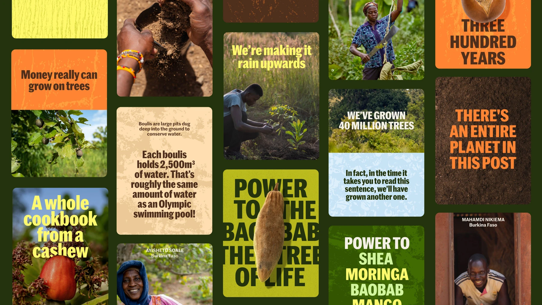
The new logo brings together human forms, growth and canopy in a confident, unfussy mark.
The colour palette is drawn from the real hues of West Africa and Ethiopia — earthy, warm, unmistakably rooted in place.
It doesn’t aestheticise poverty. It respects context.
More importantly, the imagery shifts the centre of gravity away from abstract impact metrics and towards people.
Not as symbols.
As protagonists.
Farmers, communities, families — photographed with dignity, clarity and intent.
It feels evidence-led rather than emotionally manipulative, which is rarer than it should be in this sector.


When Nature Co-Designs The Brand
Then there is the detail that could easily sound like gimmickry, but doesn’t.
forpeople developed a digital texture generator that responds to the bio-electrical pulses of living trees, creating moving backgrounds that quite literally carry nature’s rhythm into Tree Aid’s digital presence.
Bark rubbings. Shea nut patterns. Foliage textures.
This isn’t “nature-inspired” design.
It is nature participating in the system.
In an industry obsessed with generative AI, this is a timely reminder that the most powerful generator we have is still the natural world — if we’re prepared to pay attention.
Finding A Voice With Urgency And Respect
The verbal identity has been tightened too. Bolder. More direct. Less hedging.
There’s urgency in the language, but not panic.
Confidence, without corporate gloss.
The new tagline, Resilient by Nature, neatly captures both the communities Tree Aid works with and the future it is actively helping to build.
Crucially, this wasn’t designed in a London vacuum.
African teams were involved throughout, shaping feedback and ensuring the brand reflects lived realities, not distant assumptions.
That collaborative integrity is felt in the final work.
A Rebrand That Earns Its Optimism
As Tree Aid approaches its 40th year, this rebrand doesn’t feel like a victory lap.
It feels like a recommitment.
The launch is accompanied by a short film narrated by Adjoa Andoh, which brings warmth and gravitas without tipping into sentimentality.
It reinforces the same idea the brand now stands for: resilience is not abstract.
It is grown, season by season, hand in hand.
In a world of over-designed purpose statements and under-delivered promises, Tree Aid’s new identity offers something rarer — a brand that behaves like the thing it believes in.
Patient. Grounded.
And built to last.