Some brands spend decades trying to find a voice. KitKat spent 70 years building one so recognisable it can now afford to go quiet.
In its latest outdoor campaign, “Little Breaks,” created by VML UK, the brand does something that would terrify most marketers.
It drops the line. No “Have a Break. Have a KitKat.” No explanatory copy. No clever headline trying to outwit the audience. Just the logo. And a few almost invisible drawings.
A Poster That Makes You Pause
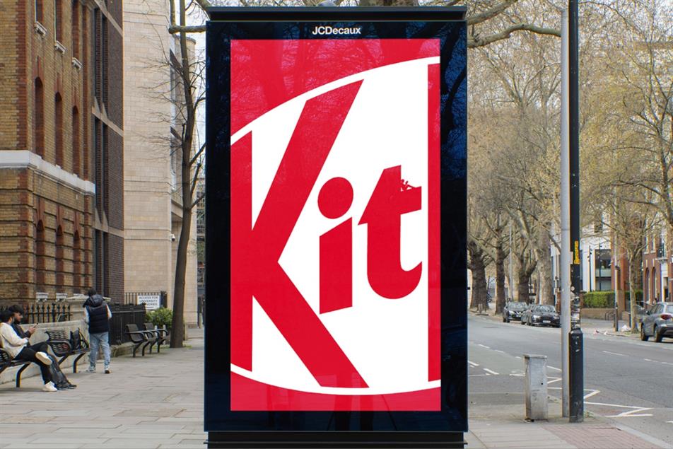
At first glance, the posters feel unfinished. A familiar red. The cropped KitKat wordmark. Nothing more. Then you look again.
Inside the curves and negative spaces of the logo are tiny hand-drawn moments. Someone reading. Someone strumming a guitar. Someone doing absolutely nothing at all. Little pockets of stillness hidden in plain sight.
The work does something quietly radical. It forces you to slow down.
You do not just see the ad. You engage with it. You search. You lean closer. You spend time with it. In doing so, you perform the very behaviour the brand has owned since the late 1950s.
You take a break.


When Brand Becomes Behaviour
This is not just a design exercise. It is brand strategy executed with discipline.
KitKat has always been less about chocolate and more about permission. Permission to stop. Permission to step away. Permission to do nothing without guilt.
What “Little Breaks” does is translate that long-held idea into behaviour. The campaign does not tell you to take a break. It creates a moment where you naturally do. That is a subtle but important shift.
Last year’s “Phone Break” campaign nudged people to put their devices down. This one goes further. It removes the instruction altogether and lets curiosity do the work. The reward is not just visual delight. It is the experience of pausing in a world that rarely allows it.
The Confidence to Subtract
Most advertising today suffers from the same condition. It tries too hard.
Too many messages. Too many claims. Too much anxiety about being ignored. So brands shout. They add more colour, more copy, more urgency. In doing so, they often become easier to ignore.
“Little Breaks” moves in the opposite direction. It subtracts.
No tagline. No product shot. No rational argument. Just a logo strong enough to carry meaning on its own, and an idea simple enough to invite participation.
This is not minimalism as an aesthetic choice. It is minimalism backed by decades of consistency. KitKat has earned the right to do less because it has spent years doing the same thing, again and again, until it became part of culture. Most brands have not.
The Discipline Behind the Simplicity
Work like this looks easy. It is anything but.
To arrive at a poster that appears almost empty requires a level of restraint that many clients and agencies struggle to maintain. It demands confidence in brand assets. It demands trust in the audience. It demands a clear understanding of what the brand truly stands for.
Remove the wrong element and the whole thing collapses. Keep just enough, and it sings.
The hand-drawn illustrations are doing more heavy lifting than they appear to. They humanise the work. They introduce warmth. They reward attention. Without them, the campaign risks feeling like an exercise in design purity. With them, it becomes a small, delightful discovery.
A Lesson for Malaysian Marketers
There is a tendency in our market to equate impact with volume. Louder visuals. Longer copy. Bigger claims.
But attention today does not work that way. People are not short of messages. They are short of moments.
“Little Breaks” offers a useful reminder. If your brand is strong enough, you do not need to chase attention. You can invite it. You can create work that asks for a second look instead of demanding the first.
Of course, this is easier said than done. KitKat’s simplicity is built on seventy years of consistency. It has repeated the same idea until it became instinctive. That is the real lesson. Consistency buys you the right to be quiet.
The Quiet Power of a Well-Earned Idea
In a landscape crowded with brands trying to be louder, faster and more visible, KitKat has chosen to do something else entirely. It has chosen to whisper.
And in that whisper, it reminds us of something the industry often forgets. The strongest ideas do not need constant reinforcement. Once they are embedded, they can be expressed in a glance, a shape, even a blank space.
Or in this case, in a logo that quietly asks you to stop. And for a brief moment, you do.